Category: Block

Items in the block category have been created with the block editor.

  • Block: Gallery

    Block: Gallery

    Gallery blocks have two settings: the number of columns, and whether or not images should be cropped. The default number of columns is three, and the maximum number of columns is eight.

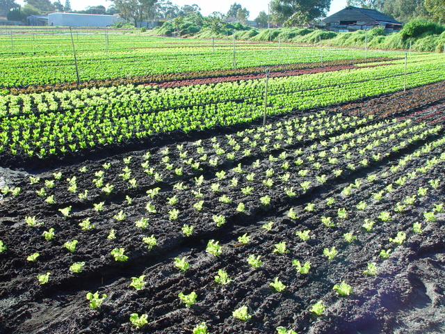
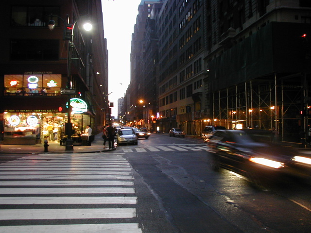
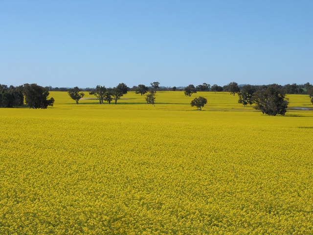
    Below is a three column gallery at full width, with cropped images.
    Some more text for taking up space.

    A two column gallery, aligned to the left, linked to media file.

    In the editor, the image captions can be edited directly by clicking on the text.

    If the number of images cannot be divided into the number of columns you have selected, the default is to have the last image(s) automatically stretch to the width of your gallery.

    A four column gallery with a wide width:

    A five column gallery with normal images:

    This is the same gallery, but with cropped images.

    Six columns: does it work at all window sizes?

    Seven columns: how does this look on a narrow window?

    Eight columns:

  • Block: Columns

    This page tests how the theme displays the columns block. The first block tests a two column block with paragraphs.

    This is the second column. It should align next to the first column. Reduce the browser window width to test the responsiveness.

    This is the second column block. It has 3 columns.

    Paragraph 2 is in the middle.

    Paragraph 3 is in the last column.

    The third column block has 4 columns. Make sure that all the text is visible and that it is not cut off.

    Now the columns are getting narrower.

    The margins between the columns should be wide enough,

    so that the content of the columns does not run into or overlap each other.

    Column one.

    Column two.

    Column three.

    Column four.

    Column five.

    To change the number of columns, select the column block to open the settings panel. You can show up to 6 columns. If the theme has support for wide align, you can also set the alignments to wide and full width.

    Below is a column block with six columns, and no alignment:

    Column one.

    Column two.

    Column three.

    Column four.

    Column five.

    Column six.

    Next is a 3 column block, with a wide alignment:

    Column one.

    Column two.

    Column three.

    And here is a two column block with full width, and a longer text. Make sure that the text wraps correctly.

    This is column one. Sometimes, you may want to use columns to display a larger text, so, lets add some more words. Lorem ipsum dolor sit amet, consectetuer adipiscing elit. Donec mollis. Quisque convallis libero in sapien pharetra tincidunt. Aliquam elit ante, malesuada id, tempor eu, gravida id, odio. Maecenas suscipit, risus et eleifend imperdiet, nisi orci ullamcorper massa, et adipiscing orci velit quis magna. Praesent sit amet ligula id orci venenatis auctor. Phasellus porttitor, metus non tincidunt dapibus, orci pede pretium neque, sit amet adipiscing ipsum lectus et libero. Aenean bibendum. Curabitur mattis quam id urna. Vivamus dui. Donec nonummy lacinia lorem. Cras risus arcu, sodales ac, ultrices ac, mollis quis, justo. Sed a libero. Quisque risus erat, posuere at, tristique non, lacinia quis, eros.

    Column two. Cras volutpat, lacus quis semper pharetra, nisi enim dignissim est, et sollicitudin quam ipsum vel mi. Sed commodo urna ac urna. Nullam eu tortor. Curabitur sodales scelerisque magna. Donec ultricies tristique pede. Nullam libero. Nam sollicitudin felis vel metus. Nullam posuere molestie metus. Nullam molestie, nunc id suscipit rhoncus, felis mi vulputate lacus, a ultrices tortor dolor eget augue. Aenean ultricies felis ut turpis. Lorem ipsum dolor sit amet, consectetuer adipiscing elit. Suspendisse placerat tellus ac nulla. Proin adipiscing sem ac risus. Maecenas nisi. Cras semper.

    We can also add blocks inside columns:

    1. This is a numbered list,
    2. inside a 3 column block
    3. with a wide alignment.

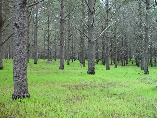
    The middle column has a paragraph with an image block below.

    canola
    Lorem ipsum dolor sit amet, consectetuer adipiscing elit. Donec mollis. Quisque convallis libero in sapien pharetra tincidunt. Aliquam elit ante, malesuada id, tempor eu, gravida id, odio. Maecenas suscipit, risus et eleifend imperdiet, nisi orci ullamcorper massa, et adipiscing orci velit quis magna.
    -This third column has a quote

    Theme Reviewer

    But wait there is more!  We also have a block called Media & Text, which is a two column block that helps you display media and text content next to each other, without having to first setup a column block:

    dsc20050813_115856_52

    Media & Text

    A paragraph block sits ready to be used, below your headline.

  • Block: Quote

    The quote block has two styles, regular:

    Gutenberg is more than an editor.

    The Gutenberg Team

    and large:

    Yes, it is a press, certainly, but a press from which shall flow in inexhaustible streams, the most abundant and most marvelous liquor that has ever flowed to relieve the thirst of men!


    Johannes Gutenberg

    The quote blocks themselves have no alignments but the text can be aligned, bold, italic, and linked:

    Right

    Theme Review

    In addition to the quote block, we also have the pull quote, with a regular and a solid color style.

    You can change the color of the border and the text with the regular style:

    In addition to the quote block, we also have the pull quote.

    Theme Reviewer

    Or change the background color and text color with the solid color style:

    a solid color style

    Theme Reviewer
  • Block category: Common

    The Common category includes the following blocks: Paragraph, image, headings, list, gallery, quote, audio, cover, video.

    The paragraph block is the default block type.  It should not have any alignment of any kind. It should just flow like you would normally expect. Nothing fancy. Just straight up text, free flowing, with love.

    This paragraph is left aligned.

    This italic paragraph is right aligned.

    Neither of these paragraphs care about politics, but this one is bold, medium sized and has a drop cap.

    This paragraph is centered.

    This paragraph prefers Jazz over Justin Timberlake. It also uses the small font size.

    This paragraph has something important to say:  It has a large font size, which defaults to 36px.

    The huge text size defaults to 46px, but the size can be customized.

    This paragraph is colorful, with a red background and white text (maybe). Colored blocks should have a high enough contrast, so that the text is readable.

    Below this block, you will see a single image with a circle mask applied.

    Image Alignment 150x150

    H1 Heading

    H2 Heading

    H3 Heading

    H4 Heading

    H5 Heading
    H6 Heading

    Ordered list

    1. The software should be licensed under the GNU Public License.
    2. The software should be freely available to anyone to use for any purpose, and without permission.
    3. The software should be open to modifications.
      1. Any modifications should be freely distributable at no cost and without permission from its creators.
    4. The software should provide a framework for translation to make it globally accessible to speakers of all languages.
    5. The software should provide a framework for extensions so modifications and enhancements can be made without modifying core code

    Unordered list

    • One
    • Two
    • Three
      • Four
    • Five

    Quote

    Cite

    Cover block with background image

    The file block has a setting that lets us show or hide a download button with editable text:

    Video blocks have settings for showing and hiding the playback controls. Use autoplay and playback controls responsibly.

    This is a video block caption.

    The video block below is muted and has a poster image that displays before the video starts:

  • Block category: Embeds

    This post tests various embed blocks:

    https://twitter.com/WordPress/status/1057136472321613824
    Twitter,  wide width
    YouTube
    https://www.facebook.com/6427302910/posts/10156380423617911/
    https://www.instagram.com/p/BpmueLLgEn_/?utm_source=ig_share_sheet&igshid=1hcxphic7p9e2
    WordPress TV, full width

  • Block category: Widgets

    The shortcode widget:

    The Archive Widget:

    The same Archive widget but as a dropdown:

    January 2025
    M T W T F S S
     12345
    6789101112
    13141516171819
    20212223242526
    2728293031  

    The Category widget block has an additional option for showing category hierarchies:

    The Latest Comments widget can display or hide the avatars, the date, and the comment excerpt:

    1. Hi, this is a comment. To get started with moderating, editing, and deleting comments, please visit the Comments screen in…

    Here is an example of the Comments widget with all the options disabled. The number of comments has been reduced to two.

    And here is the Latest Posts widget in the list view, with dates:

    Grid view, now sorted from A -Z.

    You can also change the number of columns used to display the latest posts. The block below only displays posts from the Block category:

    Search widget:

    Tag Cloud widget:

    alignment captions categories chat Codex Columns comments content περιεχόμενο css edge case embeds excerpt featured image formatting gallery html image jetpack layout link lists markup Post Formats quote readability read more Sample shortcode standard status sticky Success Swagger Tags template test tag tiled title trackbacks twitter Unseen video videopress WordPress wordpress.tv

    RSS Feed widget:

  • Block category: Layout Elements

    The Layout Elements category includes the following blocks: Group, Button, Columns, Media & Text, separator, spacer, read more, and page break.

    This group block has a light green background color.

    The read more block should be right below this text, but only on list pages of themes that show the full content. It won’t show on the single page or on themes showing excerpts.

    (more…)

    Pages: 1 2

  • Block category: Formatting

    The formatting category includes the following blocks:

    The code block starts with
    <!-- wp:code -->
    <?php echo 'Hello World'; ?>
    

    The classic block can have almost anything in it.


    a heading
    The custom HTML block lets you put HTML that isn’t configured like blocks in it. (this div has a width of 45%)
    The preformatted block.

    The Road Not Taken

    Robert Frost
    Two roads diverged in a yellow wood,
    And sorry I could not travel both (\_/)
    And be one traveler, long I stood (='.'=)
    And looked down one as far as I could (")_(")
    To where it bent in the undergrowth;

    Then took the other, as just as fair,
    And having perhaps the better claim, |\_/|
    Because it was grassy and wanted wear; / @ @ \
    Though as for that the passing there ( > º < )
    Had worn them really about the same, `>>x<<´
    / O \
    And both that morning equally lay
    In leaves no step had trodden black.
    Oh, I kept the first for another day!
    Yet knowing how way leads on to way,
    I doubted if I should ever come back.
    I shall be telling this with a sigh
    Somewhere ages and ages hence:
    Two roads diverged in a wood, and I—
    I took the one less traveled by,
    And that has made all the difference.


    and here's a line of some really, really, really, really long text, just to see how it is handled and to find out how it overflows;

    The pull quote can be aligned or wide or neither.

    Theme Reviewer
    The table blockThis is the default style.
    The cell next to this is empty.
    Cell #5
    Cell #6
    This is the striped style.This row should have a background color.
    The cell next to this is empty.

    This table has fixed width table cells.

    Make sure that the text wraps correctly.

    The Verse block

    A block for haiku?
    Why not?
    Blocks for all the things!